
The One Room Challenge Week 6: guide to mixing metals + tile is finally happening!
- Tara Lenney

- Jun 10, 2021
- 6 min read
Updated: Jun 6, 2022
Post contains affiliate links.
It’s Week 6 of the ORC and our bathroom is actually almost looking like a bathroom! Before we talk about mixing metals and this week’s progress, here’s where we’ve been so far:
Week 1: Before and The Design Plan
Week 2: Demo and The Design Details
Do I have anxiety that this won't all come together by the end of June?! MAYBE! But then I remind myself that we aren't curing cancer or saving baby kittens, and we will just do our best. The guys are working SO HARD to get this done. This week we have:
Installed cement backer board for tile
Tiled the floor (hooray)
Begun wall tile (double hooray)
Installed cabinetry boxes
Measured for countertops

Here's a shot just before the cabinetry went in. The beautiful tile is right under that floor protection. That green looking drywall is actually cement backer board for the wall tile that will go there.

Drywall is complete over by the closet pocket door and behind the vanity as well.

Remember how I mentioned last week on Insta Stories that we were missing that shower valve? Well, it came in (thank you rush shipping) so this wall can finally be closed up. The guys are working on that now.
Also, I'm saving all of my ORC Instagram stories in a highlight, so you can find the whole process from start to finish here.

And look at these herringbone floors! SO AMAZING. People ask us if herringbone is trendy and will it go out of style. It's about as classic of a pattern as you can get. Things come in and out of being the most popular, but herringbone is super classic. If you love it, DO IT.
Now for our cabinet bases!

And finally the shower wall tile in progress.

Coming along!! Now for some fun stuff.
MIXING METALS
On nearly every bathroom and kitchen project we work on, we get this question: “Can I mix metals in the same space?”
We’re here to tell you, not only is the answer, YES YOU CAN but also YOU SHOULD. Wait, what?! Yup, we strongly recommend mixing metals in your space for 2 big reasons:
It makes the space feel layered and collected, rather than straight out of a catalog, and
It gives you flexibility over time. If you’ve got more than one metal in the space, then you don’t have to stand in the aisle of Home Goods having an identity crisis on whether you can bring a brass doo-dad into your room without it looking out of place. You’ve got a palette of finishes to play with.
But there is an art to it. There’s a few metals that really do not play well together, and some that look better together than on their own. Let’s break ‘em down!

GUIDELINE #1 - UNDERSTAND UNDERTONES
Undertones are SO CRITICAL in choosing metal finishes, paint colors, and basically all materials. If you have no idea what I’m talking about, an undertone is a color under the color you’re looking at. Gray is a great example. Have you ever picked out a gray paint and put it up on the wall, and it turns lavender? That means it has a purple undertone. Or it turns green? Yep, the green undertone is the culprit. Nearly every material has some sort of undertone that you need to identify.
Chrome – a silver color with a cool undertone, typically with a blue tint
Oil rubbed bronze – brown color with a warm undertone, often with red or orange
Nickel – a silver color with a warm undertone, just a bit of yellow or orange. This one is subtle, but you see it when you hold it next to chrome.
Brass – a soft golden color with a warm undertone that reads yellow, pink, or orange
Antique Brass - a soft golden brown color with a warm undertone that reads yellow, pink, or orange
Gold – a bright golden color with a warm undertone that read yellow, pink, or orange
Rose Gold or Copper – soft pink-orange color with a warm undertone in orange or pink
Black – this can sometimes feel like a true color, but every once in a cool undertone of purple or green slips in there. But black is a pretty safe bet that you’ll get what you expect.]
White – same story as black. Usually white is white, but it can have warm or cool undertones. But it universally looks great with just about everything.
Ok, so how is this helpful!?! It’s important because it leads to rule #1 of mixing metals – when in doubt, keep the same undertones. Cool undertones and warm undertones often don’t mix great, though there are some exceptions. You’ll see all of our favorite combos in the graphic below!
Top tip – never, ever, EVER mix chrome and nickel. They are both silver tones, but with different undertones, and they will look awful together.

Here we mixed polished nickel and brass. Both have warm undertones, making them a great match. The plumbing fixtures are polished nickel and the hardware and lighting are brass.
GUIDELINE #2 – FINISHES
Brushed, satin, polished, hammered, matte – all of that comes into play too. In our book, you can mix these together effectively! Polished nickel or chrome look great with matte black. Hammered copper works with satin oil rubbed bronze. Satin antique brass works with polished nickel.
The only thing that we don’t recommend – mixing 2 finishes in the same color. For example, don’t mix polished nickel and brushed nickel – it will look like you tried to make them all match, but missed.
The rule – if your colors are different (silver tones, brass tones, brown tones, black tones) then you can mix the finishes.

Here we mixed chrome and matte black. The plumbing fixtures, mirrors, and cabinet hardware are matte black, and we popped in a bright polished chrome on the light fixture.
GUIDELINE #3 – HOW MANY METALS TO MIX
Our rule – always 2, but no more than 3, will create a layered space that still feels unified and intentional. When you get above 3 metal finishes, you get into the land of Eclectic. If Eclectic is your jam, then roll with it! But if your goal is to create a cohesive, pulled-together space, stick with 2-3.
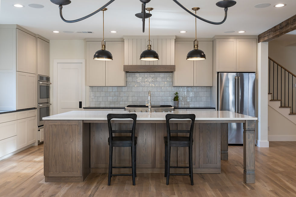
Tip – we don’t include stainless steel appliances in that count. They can be a 4th metal, like the image below, and still, work because our brains universally accept stainless steel appliances as their own thing.
Here we mixed polished nickel, antique brass, and black. The plumbing fixtures are polished nickel, hardware is brass (it wasn’t installed yet during this progress pic, but they were eventually brass!), and the lighting was brass and black. All have warm undertones which help them work together.
GUIDELINE #4 – WHERE TO MIX
Which pieces in your room should get which finishes? We like to keep all plumbing fixtures in a space the same. So your kitchen faucet and pot filler should be the same, and your shower faucet and sink faucet in the bathroom should be the same. Change it up by bringing in a complementary finish in your mirrors, cabinet hardware, and lighting fixtures.

Here we mixed polished chrome and polished brass. It works because, though they are both the same finish and have different undertones, they have different colors altogether (silver and gold-based). They have enough contrast to make it look intentional.
Now let's put that all into a handy dandy graphic for you!

OUR ORC MASTER BATH FINISHES
On this master bath renovation, we’re mixing polished nickel and satin and antique brass, which is such a winning combo. All have warm undertones which help them work flawlessly together, and the silver and gold colors give a great contrast. We’ll echo the warm undertones in the wood vanity and the cool undertones in the blue/gray linen cabinets and marble and blue tiles.

Sconces | Mirrors | Door Knob | Sink | Sink Faucet | Bathtub | Bathtub Filler
Cabinet Pull | Cabinet Knob | Towel Bar | TP Holder
Here’s our weekly check-in on our ORC renovation:
Done / In The Works:
Demo
Plumbing
Electrical Rough
Framing
Build-back with drywall and cement board
Install (some of) tile
Install vanity
To Do:
Install countertops and fixtures
Trim out windows, baseboards, install new doors, and (hopefully) order window treatments
Art and finishing touches
See you next week when we’ll share more progress and clever our favorite way to incorporate wallpaper into your bathroom!

Some of these links are affiliate links which means if you click the link to purchase something on this page, it won't cost you more, but we may receive a commission for sharing this with you. Which is neat, because I was going to share it with you anyway! You can view our full disclosure policy here.


I’ve been searching for a leather jacket that feels unique, and I think the Taylor Tomlinson Prodigal Daughter Black Leather Coat might just be it. The silhouette is flattering, the design has personality, and it’s the sort of piece that could easily become the focal point of your wardrobe. Absolutely worth checking out.
The content was really very interesting. I am really thankful to you for providing this unique information You have a good point here! I totally agree with what you have said!! Thanks for sharing your views. Life of a Showgirl Cardigan
The content was really very interesting. I am really thankful to you for providing this unique information You have a good point here! I totally agree with what you have said!! Thanks for sharing your views. Tate Langdon Sweater
The content was really very interesting. I am really thankful to you for providing this unique information You have a good point here! I totally agree with what you have said!! Thanks for sharing your views. Berlinc Hoodie
The fashion perspective here feels authentic and easy to follow and Kevin Hart Acting My Age Leather Jacket supports the idea of confident everyday dressing.