
Choosing the right white paint colors

It might be the question we’re asked more often than any other:
“What is the best white paint?!”
Well, as you might imagine, it’s not quite that simple!
While you might think that white is white is white, that couldn’t be farther from the truth. Walk down any paint aisle at the 48451 white paints and you’ll find that out real quick.
Here are a few tips on how we choose the right white paint colors for our client's homes (and our own!). Be sure to scroll all the way to the end for our Tried and True white paint colors AND the combinations that work every time!
STYLE
Your design style can help dictate what white might be right for you. More modern homes often tend towards cooler or neutral whites, while classic or traditional homes often lean towards warmer whites.
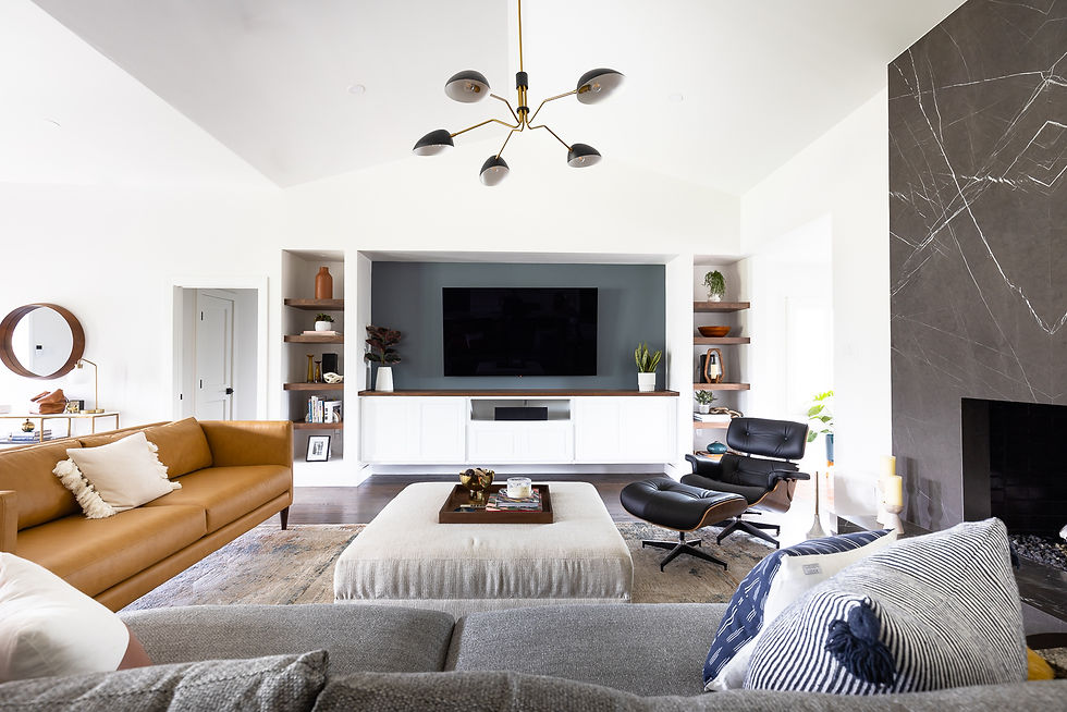
For this contemporary home, we opted for Sherwin Williams Snowbound on the walls SW 7004. Modern homes tend to want to avoid creamy warm whites. Cooler and neutral whites tend to complement and enhance artwork and other features to let them shine.
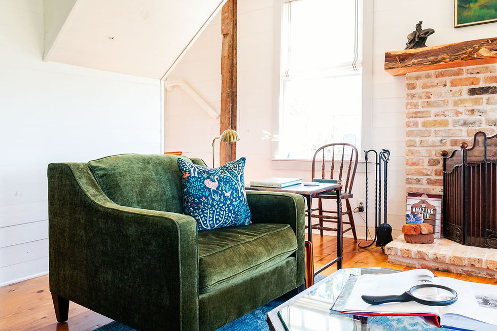
Want your white walls to feel more like a warm hug? For this 1869 restored Farmhouse, a warmer white (Sherwin Williams Alabaster SW 7008), was the right call for the shiplap walls. Warm and inviting was the vibe we wanted to create here, so a cool white would have been a swing and a miss.
UNDERTONE
So, what actually determines a cool or a warm white? It’s the undertone. All colors have an undertone, be it paint, metal, wood, anything. Every paint is made up of the base paint + tints. I’m oversimplifying a bit, but warmer whites are tinted with yellows, oranges, and reds; cooler whites are tinted with blues and purples.
A good rule of thumb with whites – stick with all cool undertones or warm undertones when selecting your wall and trim paints to achieve paint harmony.
Neutral undertones can go in either direction, so they’re like a Wild Card in the best way!

The walls and trim are painted in warm whites (BM OC-17 White Dove walls, BM OC-117 Simply White trim), perfect for a transitional style. They are a warm white without being overly yellow or buttery.

The walls are painted a neutral SW 7004 Snowbound and trim SW 7007 Ceiling Bright White for a crisp, contemporary vibe.
TEST YOUR PAINTS
If you are painting white (or any color), if you hear nothing else from me today, TEST THE PAINT. Not just in one spot, but on all 4 walls. You want to see how the sunlight in that room is going to impact the color. We’ve seen the same color look yellow in one room and totally neutral in another. If you’re going to go through the expense, especially if you’re painting the whole house, test those suckers out.
OUR GO TO WHITE PAINTS AND COMBOS
Choosing white paints for your home can feel overwhelming, so we’ve taken the guesswork out for you! Use the link below to grab our Free Guide packed with our Go-To white paints that we’ve used on countless projects. It includes which whites are our favorites for walls, cabinets, and trim, PLUS we've paired them up for you with which combos work best together for your walls and trim.
These tried and true whites won't let you down.


B33 có cách giới thiệu khá dễ theo dõi nhỉ, mình đọc lướt vẫn nắm được trang đang nói về gì mà không cần ngồi xem kỹ từ đầu đến cuối. Mình hay mất kiên nhẫn với những trang dồn quá nhiều chữ vào một chỗ, nên kiểu chia nội dung thành từng phần có tiêu đề rõ ràng thế này thấy nhẹ đầu hơn. Muốn biết thêm chỗ nào thì dừng lại đọc chỗ đó, còn chưa quan tâm thì lướt tiếp cũng không bị hụt mạch. Giao diện được giới thiệu là thân thiện, nghe cũng hợp với người chỉ muốn làm quen sơ như mình. Riêng phần tổng quan và thông tin thương hiệu có tiêu đề…
Trong lúc tìm kiếm thông tin về các website giải trí trực tuyến, mình nhiều lần bắt gặp tên f168 vip trên các diễn đàn và hội nhóm. Vì muốn có cái nhìn thực tế hơn nên mình đã truy cập thử để trải nghiệm sơ bộ. Điều mình đánh giá cao là giao diện được trình bày khá khoa học, các mục thông tin được sắp xếp hợp lý nên dễ thao tác.
Mình bắt đầu khám phá nhà cái f168 từ một bài được nhắc đến trong phần bình luận liên quan của nội dung mình đang tìm hiểu. Mình chủ yếu xem và sử dụng bằng điện thoại nhưng trang vẫn hiển thị rõ, cuộn và đọc khá thoải mái. Nhìn chung, đây là một trang khá thuận tiện để mình xem thêm thông tin khi cần.
Khi đọc các bài giới thiệu nền tảng giải trí, tôi thường thích những bài viết ngắn gọn để có thể xem nhanh trên điện thoại. Bài viết này có bố cục khá dễ theo dõi khi phần nhắc đến XX8 được đặt ở giữa nội dung. Điều đó giúp mạch bài trở nên tự nhiên hơn và không tạo cảm giác quảng cáo quá sớm. Nội dung tập trung vào trải nghiệm chung của người dùng với giao diện dễ sử dụng và nhiều danh mục quen thuộc như slot, game bài hay mini game. Nhìn chung cách diễn đạt khá nhẹ nhàng và dễ hiểu.
e39 có đáng để lướt thử không? Mình thấy là có, mang lại cảm giác lướt mắt khá thoải mái. Vừa vào trang đầu là các khối nội dung chia rành mạch, nhìn một lượt là định vị được chỗ tổng quan nằm đâu, chỗ menu nằm đâu, nên không phải loay hoay tìm, phù hợp với mọi người chơi, kể cả với người mới bắt đầu.