
4 Steps to Create a Whole-House Color Palette
- Tara Lenney

- Mar 9, 2023
- 5 min read
Updated: Mar 22, 2023

Bar none, the number 1 problem that most clients have when they knock on our door is that they’ve struggled to create a Cohesive Home. They’ve picked away at individual spaces over time, but things just aren’t pulled together.
One of the very best things you can do to work towards making your home feel Cohesive is to create a Whole House Color Palette. This involves choosing a fairly narrow set of colors as your palette, and using them all throughout your home.
Many immediately bristle at this idea thinking that using just a few colors will make their home feel flat or too matchy-matchy, but it absolutely doesn’t have to! Do this well and your house will feel curated, layered, and stylish. The beauty of this method is that your house will seamlessly flow from one room to another. The BONUS is that you will then have the freedom to rearrange and refresh your home, move things from room to room, and it will work because everything just “goes” together.
Let’s dive in!
1. IDENTIFY YOUR FAVORITE COLORS
This step should be pretty straightforward, as you might already know what colors you like and are drawn to. Right now, we’re not worrying about what goes with what, but simply identifying what colors you love.
If you’re a bit unsure, a great place to start is in your closet. We typically like to wrap our bodies in colors that make us feel good, and that very often translates to what we would want to be enveloped in at home. You could also do a high level look at your Pinterest boards to see what pops up over and over again.
We have a great free mini-course called Discovering Your Signature Style that walks through this step in more detail. Pop over and give it a look!
Examples are always helpful. Here’s a quick grab of some of my favorite colors. I created this in Canva (free!), which has a handy color eyedropper tool that will pull a color out of any photo, which is very helpful for this exercise. You could also use something like Microsoft Word or PowerPoint, or even using free paint swatches from the hardware store. We definitely recommend getting them into some sort of visual format. Trying to do this all in your head isn’t going to be super effective.

2. LOOK FOR PATTERNS
With all of your favorite colors laid out in front of you, what are you seeing? Are there a lot of neutrals? Warm colors? Cool colors? Are your favorites vibrant, or more muted?
Often, we feel like our houses need to look like whatever is popular on Instagram or what we see in our friends’ homes, and that’s just not a recipe for you loving your house! We’re all unique and thrive in different environments. If bright bold colors light you up, then note that. If bright colors totally overwhelm you and make your skin crawl, then note that.
Remember, this doesn’t have to be all or nothing. You can like a little bit of both, and that’s perfectly fine. The great thing about a Whole House Color Palette is you can dial up or down the intensity room by room. You can have a calming master bathroom retreat while also having a bolder kids playroom. The point is, don’t get bogged down. Simply look for your natural tendency towards colors.
A few thoughts to get your started. See if you identify with one or more of these Color Categories and use it as a jumping off point:
Soft - Bold - Vibrant - Muted - Neutral - Warm - Cool - Dark/Moody - Light/Airy

3. HONE THEM DOWN
With all of your favorite colors laid out in front of you, and a “Color Category” identified, it’s time to curate them down into your Whole House Color Palette.
Some tips:
You’re going to likely want a mix of lighter and darker colors. Even if you love dark and moody colors, you’re still going to need a few light colors in there for a bit of contrast.
It can help to grab a few photos of Interiors that you love. Back to Step 1, are there rooms that you find yourself Liking or Pinning over and over again? Grab a few of those images for inspiration on how your colors might go together.
You’ll typically want to choose colors with similar Saturation and Value. This is a bit of a designer/artist term so stick with me.
Saturation is how vibrant or intense a color is. A soft pink has less saturation than fire hydrant red.
Value is how much gray is in the color. Think of high-value colors like what comes out of the Crayola box. They are highly pigmented and intense. Lower value colors are much more muted.

Another handy way to keep your colors within the same tone and saturation is to look at them in a Paint Fan Deck. The paint manufacturers typically organize their colors this way. The more saturated and vibrant colors are typically grouped together, and the more muted and neutral colors are grouped together. If you choose a blue color that’s the 2nd one down from the end, for example, a green color that’s also the 2nd one down is typically of the same value and has a greater chance of looking good with your blue.
At this point you might need to tweak some of your colors from Step 1 to get them a little bit closer together in Saturation and/or Value.
As a rule, color palettes work best when most of the colors you choose have similar Saturation and Value. But know that it’s totally fine to have a wildcard in there. We did a room once that had mostly mid-value and saturation colors (aka, colorful but muted) and we threw in this random Neon Pink object on the bookshelf. It was the perfect amount of pop to create interest.
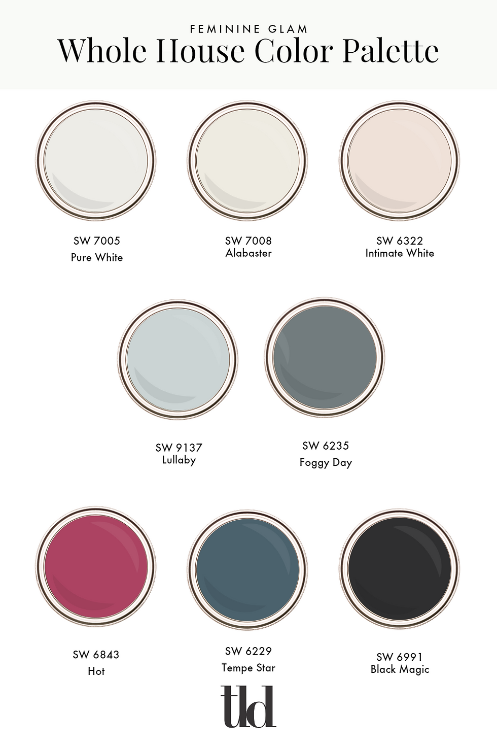
Okay! Color Theory lessons out of the way, it’s time to choose your whole house color palette. Here’s our recommendations; feel free to make them your own.
1-3 white colors / light neutrals. You’ll likely want a fairly true-white for doors, trim, and ceilings. Choose a 2nd white that’s a little less “true white” for your walls. Either an off white or grayed-white. That will allow your trim to pop against your walls.
2-4 colors. These might show up on walls, but don’t limit yourself to just paint here. These could be used for furniture, upholstery, tile, artwork, anything. When you start to get above 4, it’s trickier (though not impossible) to keep a home feeling Cohesive.
1-2 dark colors. You’ll want some touches of dark colors to ground your space. It’s old designer lore that every room needs a bit of black. That might show up in hardware, furniture, or light fixtures. Choose 1 or 2 dark colors to give your spaces some depth.
All in all, you will want about 6-9 colors to play with in your palette.
From our earlier example, here’s what my Whole House Color Palette looks like:

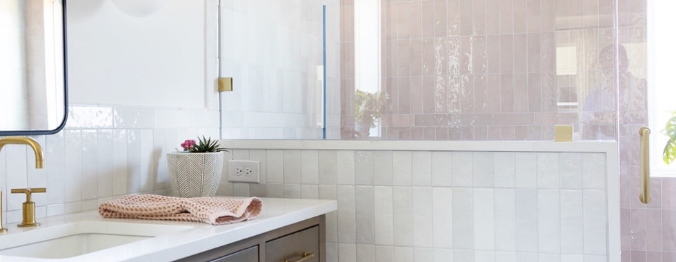
And here's how this plays out in my house.


4. HAVE FUN.
Keep in mind, these are guidelines meant to give you some structure, but also to allow you the freedom to experiment and play. If you only love light, airy homes and don’t want even a hint of black, then go for it!
Use your Whole House Color Palette as a jumping off point, but feel free to color outside the lines a little bit. If you find a mustard yellow pillow that doesn’t perfectly match your dark mustard color in your palette, but looks like it could be at home there, do it. Layering different colors within your palette is what’s going to give your space depth and character.
Here are a few palettes to get you inspired and help you get started.


Your turn! Get out there and create your Whole House Color Palette! If you need a little extra encouragement and guidance, I want to invite you again to jump into our free Defining Your Signature Style mini-course. It’s a 30 minute video that will walk you through unlocking your Signature Style, including your Color Palette, and how to start to apply that inside your home. It’s a great resource to jumpstart your home transformation.


Mình có lần lướt đọc mấy trao đổi trên mạng شيخ روحاني thì thấy nhắc nên cũng tò mò mở ra xem thử cho biết. Mình không tìm hiểu sâu rauhane chỉ xem qua trong thời gian ngắn để quan sát bố cục s3udy cách sắp xếp جلب الحبيب بالدعاء các mục và trình bày nội جلب الحبيب العنيد dung tổng thể. Cảm giác là các phần được trình bày khá gọn, các جلب الحبيب السعودية mục rõ ràng nên đọc lướt cũng không bị rối Berlinintim, với mình như جلب الحبيب بسرعة vậy là đủ để nắm tin cơ bản rồi. q8yat
This was a very helpful read! I never realized how useful a wall qiuqiu99 could be until I came across your post. It’s perfect for creating extra workspace without taking up floor area. Really appreciate the clear and practical insights. Thanks a lot!
Interesting to see the qiuqiu99 on strategic dialogue with the government. That alignment is often the key to making real progress on sustainable transitions.
I stumbled on this while scrolling through a coffee break post, noticing how escape tsunami for brainrots uses color harmony principles. The idea of narrowing down to a few colors feels counterintuitive, but the example of grouping similar saturation tones in paint decks makes sense-like how a muted green pairs well with a bold blue in the game's level design.
Creating a cohesive color palette really does transform how a home feels! Just like the right atmosphere can make a space special, one cup of cocoa creates a unique vibe too. It's amazing how colors and experiences alike shape our moods. Thanks for the great tips!