
Caledonia Project Reveal: Kitchen & Outdoor Living, Reimagined

Updated: Jul 16

UPDATE: We were thrilled to see Caledonia featured in The Dallas Morning News. If you've ever wondered how shrinking a courtyard can actually make it feel bigger, the full article shares our design thinking behind one of our favorite transformations.
Most homes have it. That weird pocket of square footage, sometimes hidden, sometimes smack in the middle of prime real estate, that just… doesn’t work.
The kind of random space that leaves you scratching your head, knowing it could be maximized, but with no real clue how to actually do it.
You just know it’s not pulling its weight. Especially when other areas of your home are feeling soooooooooo tight.
In this case, it was about 100 square feet. And rethinking it didn’t just fix one problem. It completely transformed two spaces that now work beautifully, both on their own and together.
THE STORY
When this family came to us, they had a kitchen that technically functioned, but only just. It was tight for a family of five, with a breakfast and dining situation that was overly cramped and couldn’t seat guests. The flow didn’t support how they actually wanted to live, not just as a family, but in community with friends and neighbors.
Just beyond the kitchen sat a courtyard with plenty of potential. I think my first words were something like, “Oh man, cool courtyard!”
And they were like… no.
With no cover from the Texas sun, it was basically a central box that scorched in the summer and doubled as a glorified leaf collector. There was no real reason to go out there, and no connection back to the heart of the home, which was a shame considering the kitchen, living room, and primary all looked into it.
What they wanted was clear. An indoor space that connected seamlessly to a new and improved outdoor space. It needed to be functional, inviting, and warm, but elevated enough to feel like something special.
The move was to create a kitchen and dining space where people could gather, and an outdoor setup where they could grill, host, and do gameday without thinking twice.
THE BEFORE
The kitchen was undersized for a family of five and lacked the kind of storage, layout, and breathing room that makes everyday life feel easy. We’re talking basic luxuries like space for lunchboxes and dog food. The only dining area was a small, tucked away breakfast nook, and a front sitting room wasn’t pulling its weight.
Outside, the courtyard was… fine-ish. But without coverage or purpose, it functioned more as a pass-through than a destination. It also had this odd little covered patio appendage, but more on that in a minute.
Individually, each space had its own issues. Together, they felt disconnected and underwhelming.
THE PLAN
Instead of treating the kitchen and courtyard as separate problems, we looked at them as one opportunity.
The move was deceptively simple. Reclaim about 100 square feet from the courtyard and give it back to the kitchen.
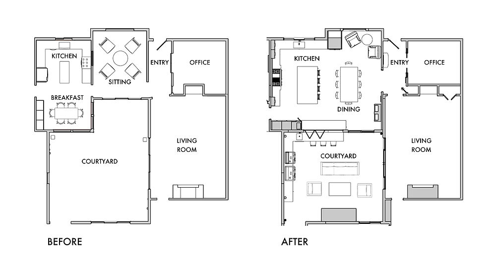
That shift allowed us to completely rework the interior, expanding the kitchen, introducing a true dining area, and creating a layout that finally supports cooking, gathering, and hosting without friction.
From there, we doubled down on connection.
As you know, I’m known for shouting wild ideas at kickoff meetings that no one asked for. And in this case, I yelped, “We need a taco truck window to the courtyard.”
Done.
We introduced an accordion window that opens the kitchen directly to the outdoors, turning the courtyard into an extension of the living space rather than an afterthought. With the new layout, these two areas work in tandem. Open them up for a party, or let them function independently for everyday life.
Inside, the design leans into that “happy, quietly colorful” foundation we saw in the rest of their home. Soft greens, blues, and pinks, warm woods, layered materials, and just enough pattern to keep things interesting without overwhelming the space.
Outside, we gave the courtyard a reason to exist. A covered structure for shade and comfort, a fully loaded outdoor kitchen, and architectural elements that create movement, light, and most importantly, shade throughout the day.
THE AFTER
ENTRY
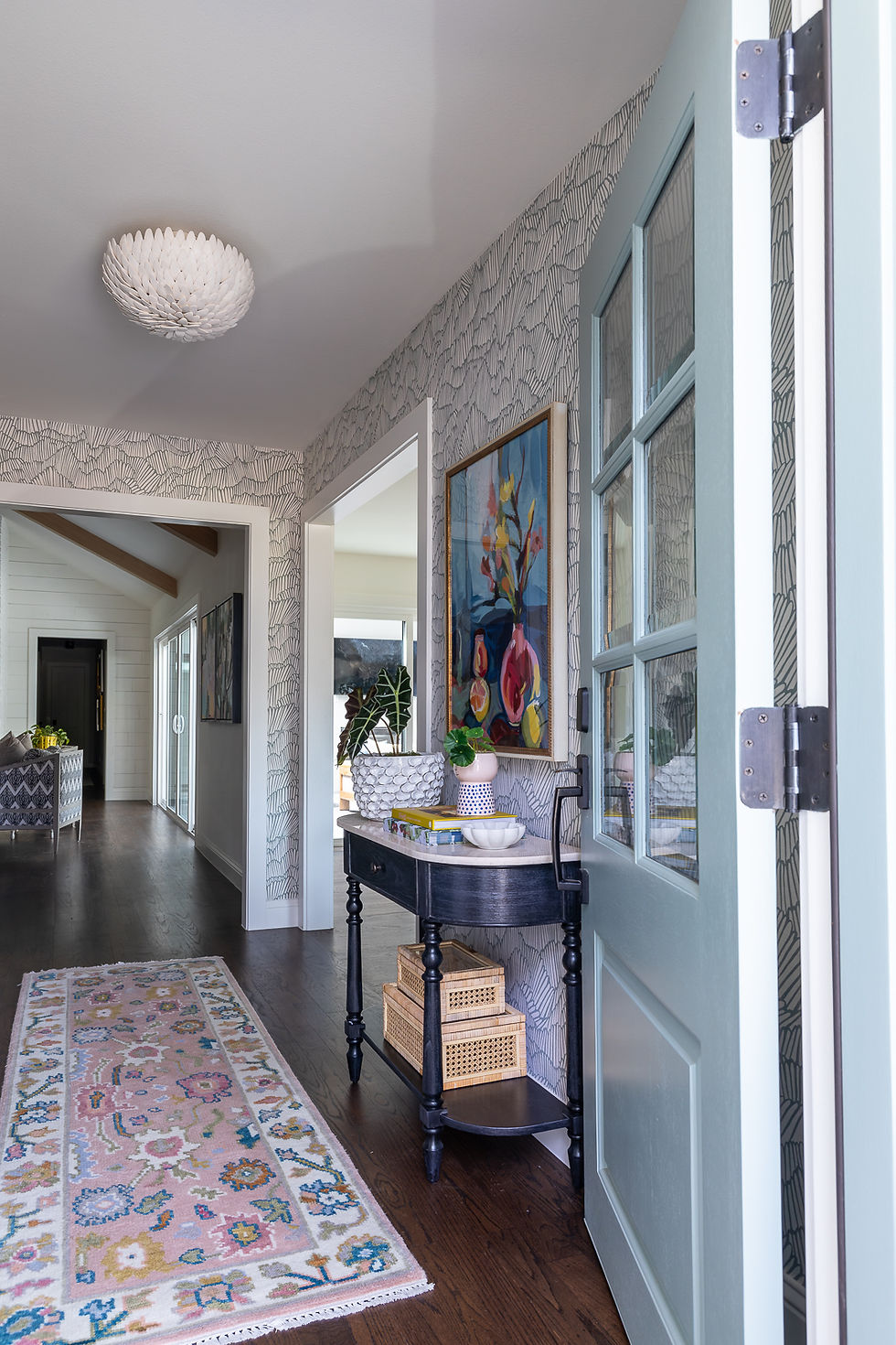
Let’s begin where all tours begin – at the front door.

The entry sets the tone for this house immediately. Why paint when you can do a wallpaper?! And we weren’t shy with the color, both in the art and the rug.

We cased the opening and squared off what was a (stupid) awkward angled wall into the living room. Now the entryway is defined and purposeful. And pretty.

A petite marble-topped table gives you just enough function at the front door, equal parts catch-all and styling moment.
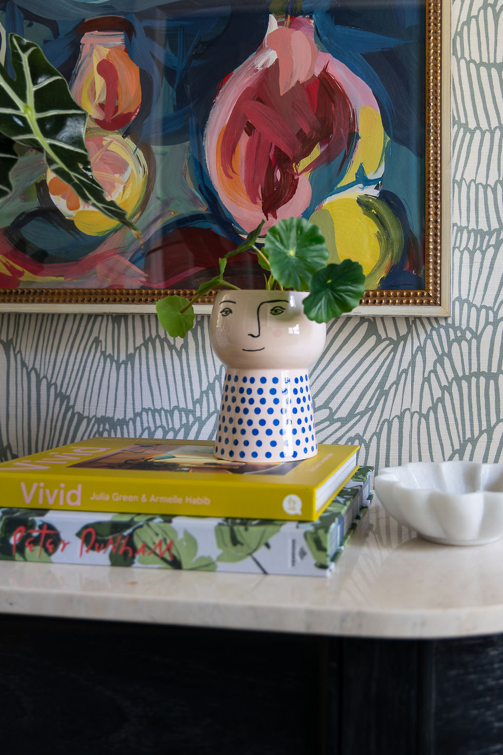

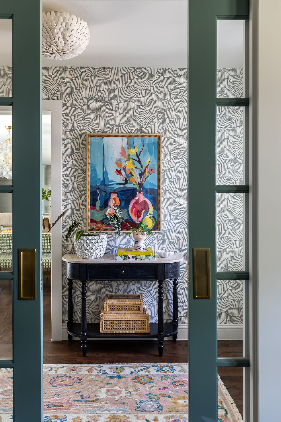
We leaned into color here, painting both the front door and new pocket office doors to add personality in a space that could have easily been overlooked.

DINING
Through the entryway, we are now in the new Dining area.

And clearly, the Dining and Kitchen are one connected amazing space, but let’s look at them one by one.

This custom dining table anchors the room and finally gives the family a place to gather that matches how they actually live. Case in point – we opted for the largest table that felt right in the room, instead of a smaller day-to-day table that would require extension leaves for hosting. Our clients (like myself) know themselves enough to know that there’s no world where I’m digging in the closet for a table leaf.
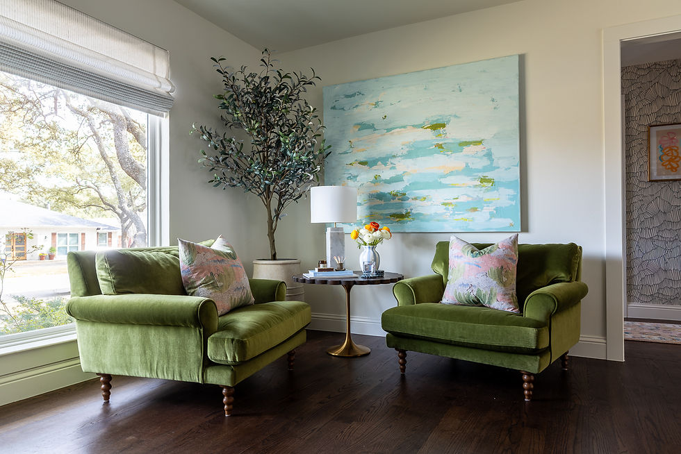

One non-negotiable was keeping two comfortable lounge chairs. The only reason the previous sitting room ever got used was for morning coffee together, so we made sure that ritual had a place to stay. So we made the chairs big, deep, and comfy.

Plus a custom scalloped edge table to hold the coffee, because why the heck not!?!

We customized the dining chair upholstery with a green and cream fabric to bring in pattern and personality that felt just a step beyond anything off the shelf.
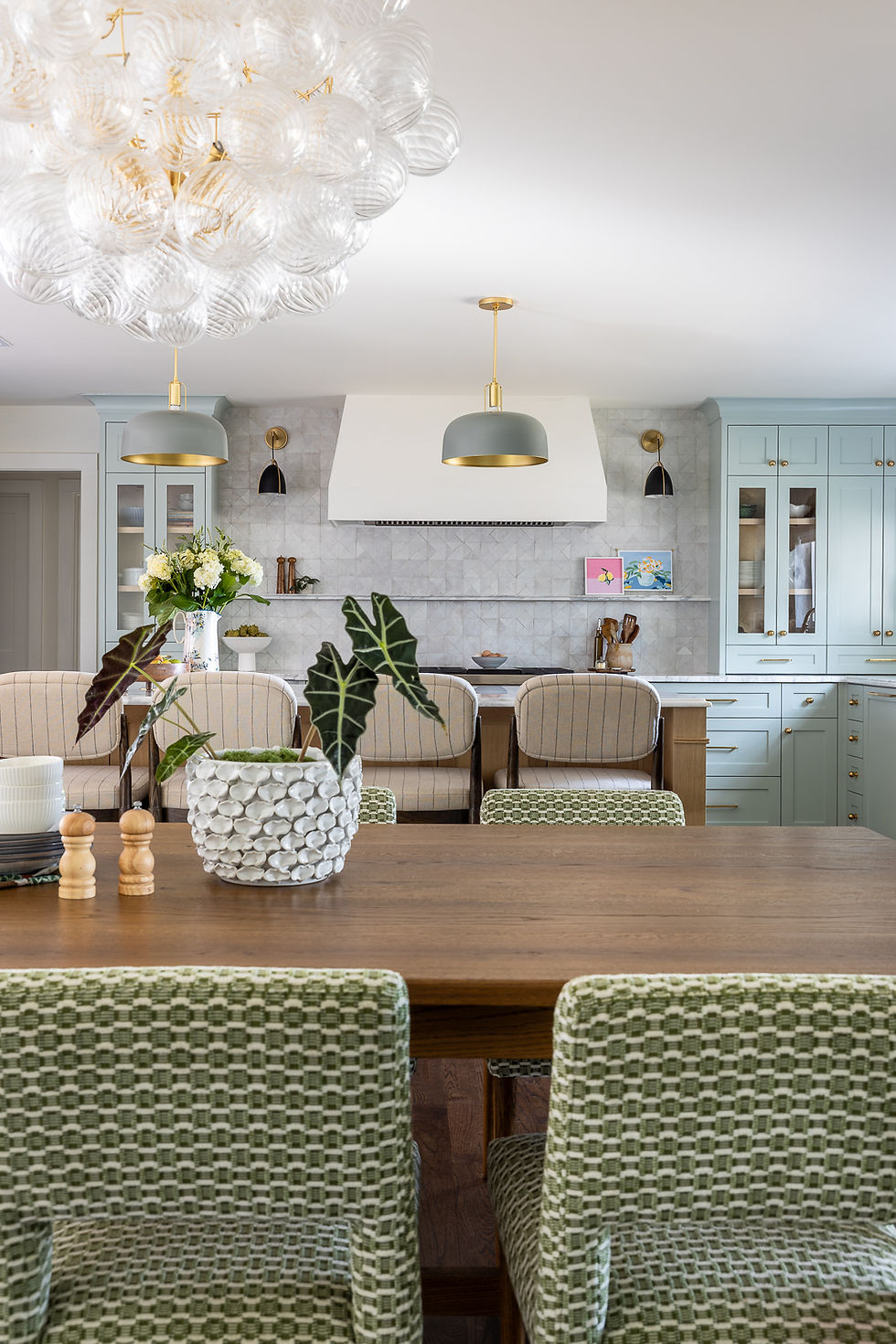
And a moment, please, for the bubble chandelier. One of my favorite lights of all time. It adds just the right amount of playfulness without competing with everything else going on in the room. We wanted something more clear to not visually dominate the whole space, and this fit the bill.

Behind the scenes, this space is working just as hard as it looks. Lighting, speakers, and surround sound are all tied into a smart system that shifts with the day, from morning routines to evening wind-downs.
KITCHEN
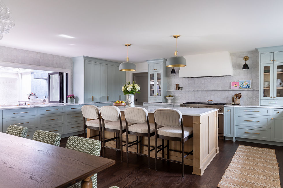
Onto the kitchen! The cabinetry color was probably the #1 thing we had to get right, because it’s so freaking key to how the space would look and feel. We went with a super soft blue-green that feels fresh but still timeless, tying beautifully into the rest of the home’s palette.

What used to be more of a landing strip is now a true island, designed for real life. Baking, homework, hosting, all of it happens here. Which is also why we made it wood instead of painted – durable against wear and tear, kids feet, dogs, and just about anything you can throw at it.

Above the island, two cutie pendants in a darker shade of our cabinet color. The inside of the shade is brass, which is unexpected and casts a warm glow when the lights are on. We also tucked the microwave and an extra set of trash cans into the island for extra functionality.

A close up of the island leg, because it’s dreamy.

We kept the sink under the front window, a particular request from our client, because she loves watching the kids play in the front yard as she’s in the kitchen. We widened the opening while we were at it. More daylight! More views!

Plus a cutie pin striped roman shade for when you’re ready to say goodnight to the neighbors.

The sink at the window keeps the island freed up entirely for prep and gathering. A small move that is “against the grain” for what many people want, and one that makes a huge difference in how the space functions. Just my loving reminder that your house is for you and noone else, so put your sink wherever you damn well please.
Just past the sink is more cabinetry (so many cabinets!) and the fridge, which is sneaky. There’s a natural jog to the front of the house – the window you’re seeing here by the cozy green chairs is actually set 2’ back from the sink wall!

We used that natural jog to our advantage, allowing a full-depth refrigerator to read like a counter-depth fridge! It took what was a challenging architectural situation and turned it into about 10 extra cubic foot of fridge space. You’d never know unless you were looking for it.
Let’s spin around and have a closer look at the cooking wall.

The vent hood is the focal point of the working wall, what draws you in from the entryway. The 48” range is incredible on its own, but why stop there?! The vent hood above is flanked by sconces (the same ones you may have spotted over the kitchen sink window). But we’re just getting started.
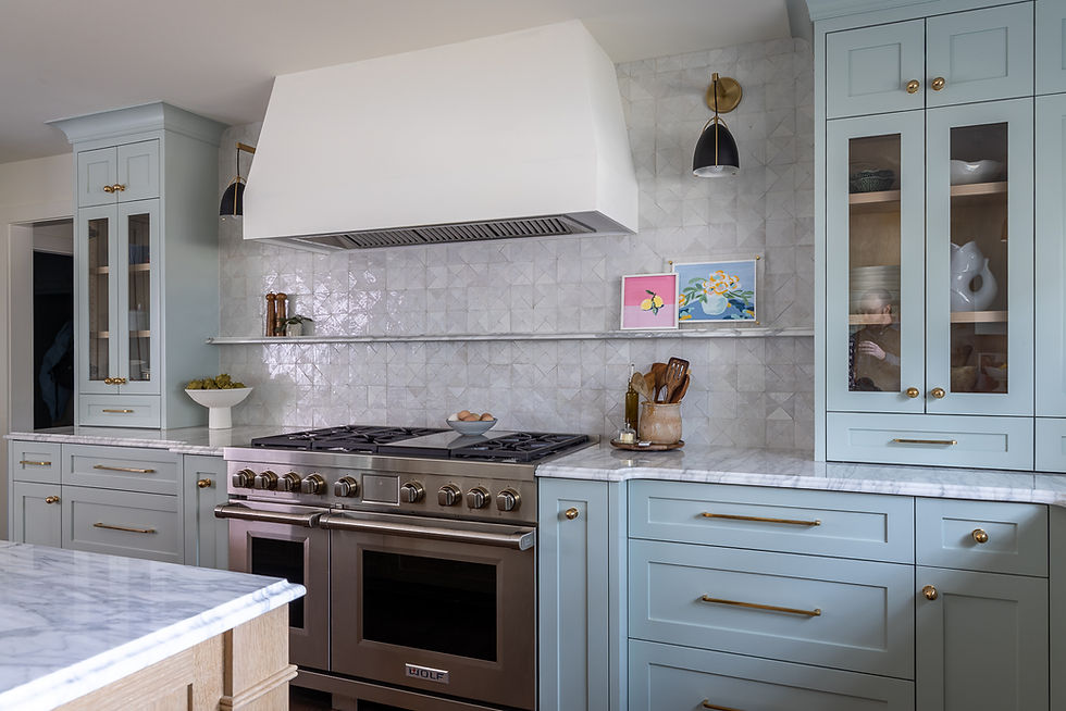
Zoom out and see the glass front cabinets that go from ceiling to counter, showing off our clients cutie collection of adorable kitchen goodies, but they do so much more than that.

Please note, the ceilings in here are only 8’ tall. I know you’re not going to believe me, but it’s true. These countertop cabinets stretch your eye upward and create the illusion of taller ceilings.

We aren’t done with details yet. Rather than a square edge on our marble counters, we opted for a decorative edge. This little schwoopy situation that gets deeper at the range makes my heart sing.

We carried that same detail onto the marble shelf that runs between our tall cabinets and over the range. There was a desire early in the design process to run the marble counters all the way up, but with the sheer volume of walls in this area, would have cost about eleventy million dollars. So instead, a textural zellige brings a different detail to the party that we are completely obsessed with.

Hello, lover. Ooooh how I love a griddle in a cooktop.

Spinning around once more, we work our way to The Wall of Cabinets and the now famous taco truck window. This connects to the new courtyard, which we’ll see in a moment. Have patience.

Cabinetry lines nearly every wall, giving them the storage they were missing without making the room feel heavy (thanks to our oh-so-perfect soft cabinet color). Drawers for days keep everything within reach.

These floor to ceiling cabinets are doing the most. This serves as the pantry for the family of five, with totally decked out and functional doors, shelves, and drawers. Plus…

an appliance garage! Coffee ready when you need it, gone when you don’t.
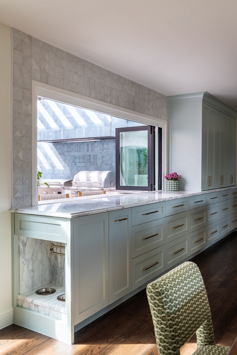
And then, a personal favorite: the dog station. Marble surround, pot filler for water, and food storage right next door.
Fully integrated, highly functional, and just a little bit extra in the very best way.
Have you seen this from TLD already? Yes. Are we stopping anytime soon? NOPE.
OK, now it’s finally time to head outside.
OUTDOOR LIVING

BEHOLD.
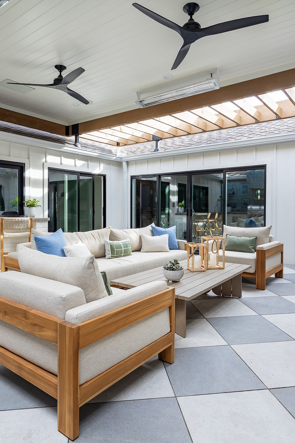
The new shade structure changes literally everything. A solid central covered area with fans, lighting, heaters, and speakers makes this space usable year-round.
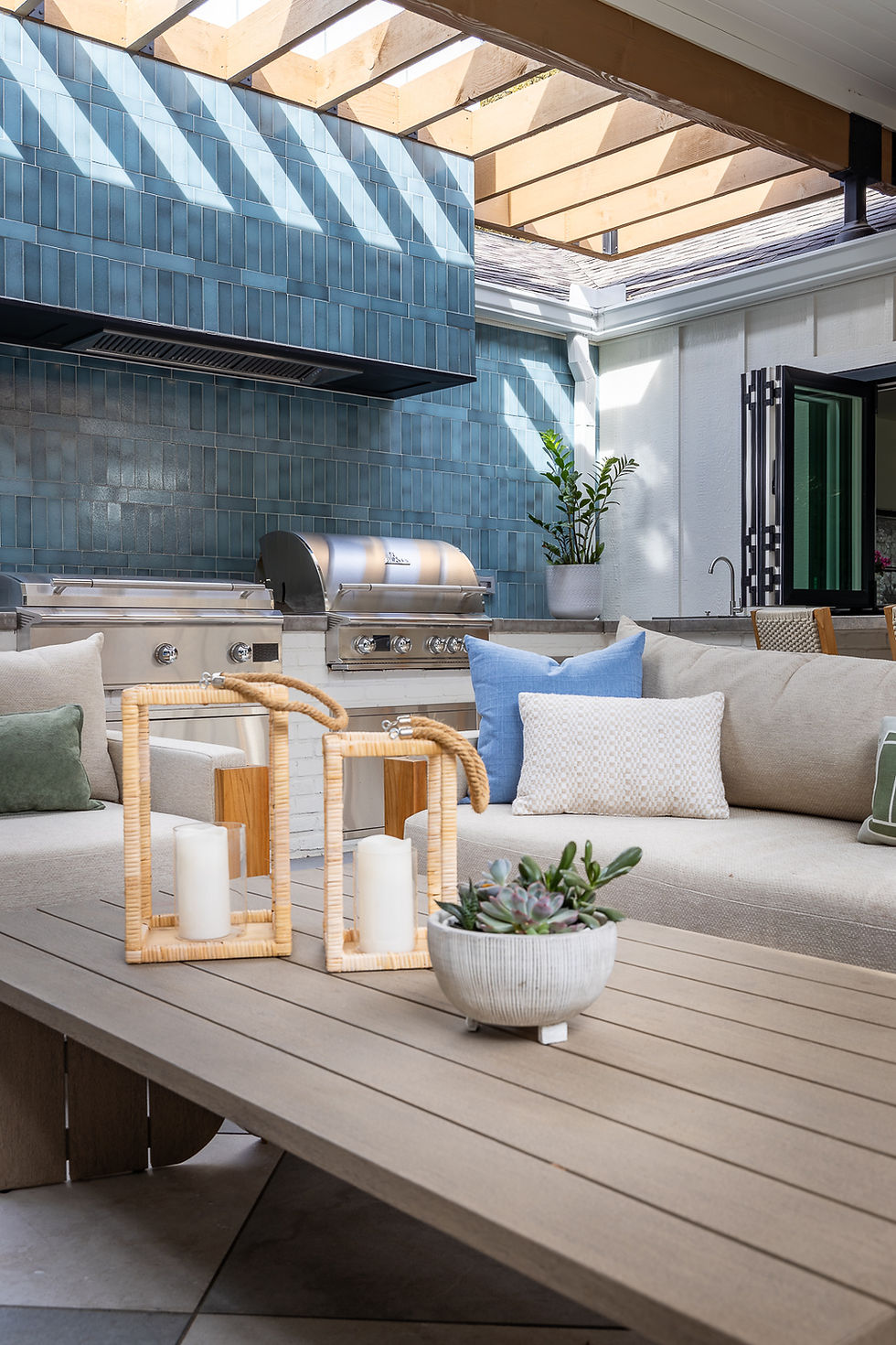
On either side, custom slatted wood panels allow airflow while casting the most incredible light patterns throughout the day. One of those moments that feels architectural and atmospheric at the same time.

Case in point.
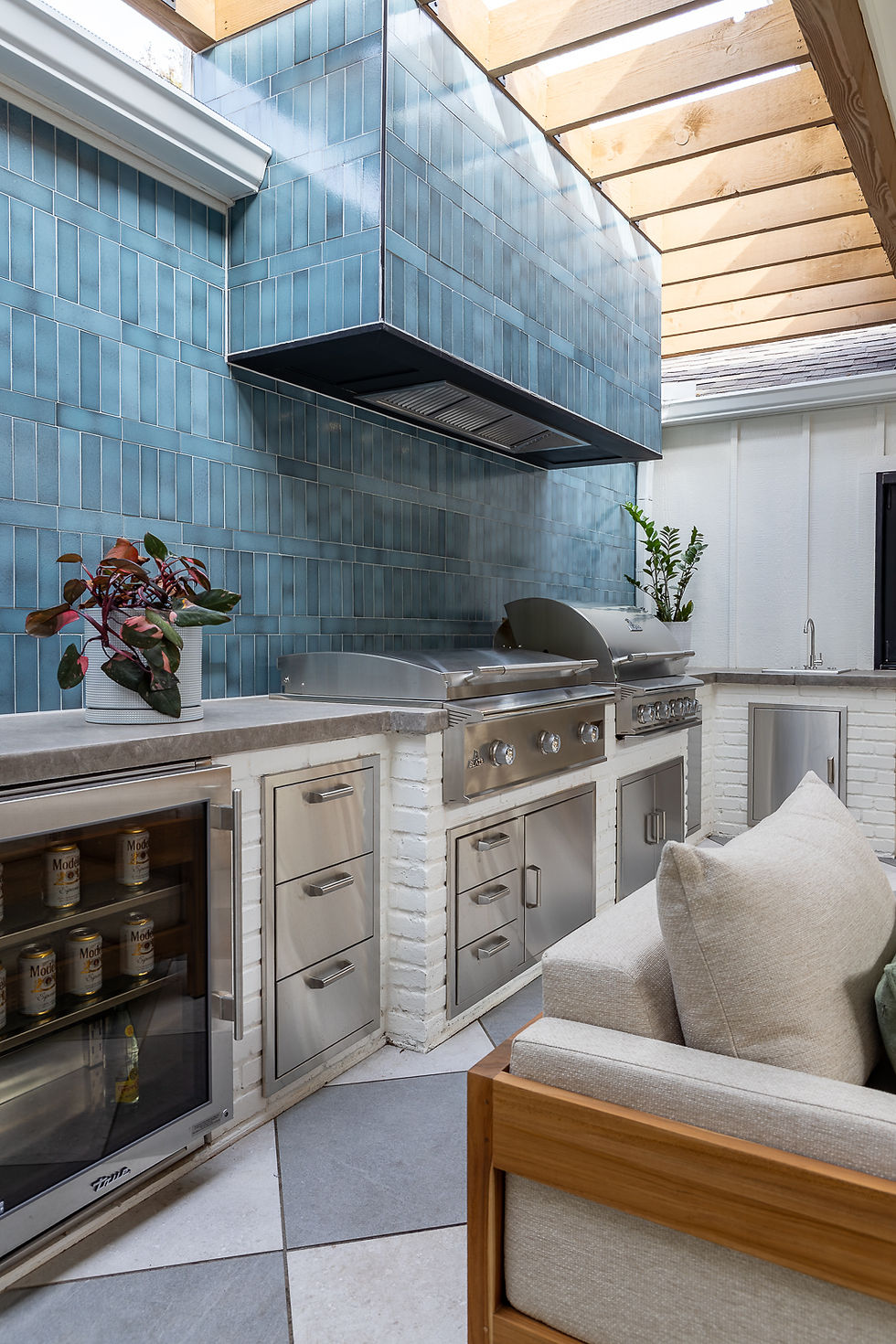
The outdoor kitchen is fully loaded. Sink, grill, flat top, exhaust hood, beverage fridge. Built for actual use, not just looks (though, it looks good).

That blue tile brings in mega personality and ties the space back to the interior palette.
The outdoor kitchen counter wraps the corner beneath the accordion window, creating a casual seating zone that connects directly back to the kitchen. No formal dining table needed here.

Instead, we leaned into how the family really lives. Perching at stools, grabbing a bite, moving in and out.

The fireplace and TV anchor the seating area, creating a cozy spot that naturally becomes the gathering place. Because let’s be honest, in front of the TV is where everyone ends up anyway.

All of it layered with performance fabrics that can handle real life, because this space was always meant to be used.

Oh, and we need to talk about the flooring situation here. We went around and around (and around) trying to find the perfect solution. And I’m so glad we did, because we landed on these insanely gorgeous cream and grey outdoor pavers that truly make the space.

So even though this courtyard is actually smaller than it was before, we multiplied the function by approximately a thousand.
This is where our tour ends. If you’ve got a space that isn’t pulling its weight, we’d love to help you reimagine it.
Until next time, friends. Stay cool (or warm, because with fans and heaters, you can have it all).


I love how this project focuses on making every bit of space actually work for the family. The thoughtful storage and practical kitchen layout are especially inspiring; something worth considering when planning around a 3 door upright freezer without sacrificing flow or style.
Sometimes a small typing mistake can stop the router login page from opening. This guide explains the common issues in a clear way, which makes it useful for people who are new to network settings.
What a brilliant transformation! It's fascinating how shrinking the courtyard actually made both the kitchen and outdoor living areas feel more spacious and connected. The "taco truck window" is such a clever detail, perfectly embodying that seamless indoor-outdoor flow, and it really highlights how rethinking spaces can open up possibilities for everything from cooking to fun sz games. 👏
Nice post! I found this information helpful and interesting. Thanks for sharing. Read more: fridge repair in Dubai
Milki Delivery is a charming, hand-drawn side-scrolling simulation adventure game developed by the creators of the hit game Minami Lane, Doot and Blibloop.The game invite players to step into the tranquil countryside of Nodoka Fields, a region once famous for its booming dairy industry but now quiet after a mysterious event affected the local livestock.