
Authon Project Reveal: A Forever Home for Family & Community
- Tara Lenney

- Oct 24, 2025
- 10 min read

Some people say they wish they hosted more. Our Authon clients actually do it.
From community group dinners to tween hangouts, this family is always opening their doors to others. But they needed their home to keep up.
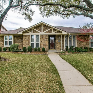
Nestled in our favorite Far North Dallas neighborhood, this 1970s ranch had all the charm of its era (using that word generously), and all the spatial challenges too.
I have lost count of how many homes we've seen with this basic floor plan setup: the 3 main bedrooms clustered together on one side of the house, with the random 4th bedroom (typically a guest room) literally on the path between the kitchen and the garage.
I guess in the 70's the message to guests was - come and stay, bask in the diesel fumes from the Gremlin, feed yourself as needed, and leave as soon as possible.
Might have worked 50 years ago, but now? The single living area was feeling a bit tight, the lack of mudroom was a problem with 3 kids and all their sports and activities, and Grandma and Grampa need a nicer place to hang out.
But the home's location was too good to leave, and the community too beloved to walk away from.
So instead, we transformed their home from the inside out - adding a second story, rethinking the entire downstairs layout, and layering in thoughtful, personal design details at every turn. The goal - a home that serves their family now, flexes for the future, and reflects their hospitality-first heart.
THE STORY
Our clients came to us knowing two things for sure: they weren’t moving, and their home wasn’t working. The layout felt cramped for their growing kids, daily rhythms, and hosting habits. But they saw the potential. More space could be added, and existing space could be reimagined.
They just didn't know what that looked like.
Their goals were practical and heartfelt: create a home that reflected their love for Jesus, welcomed others with ease, and gave every square foot a clear purpose. And maybe throw in some fun patterns, bold colors, and whimsical charm while we were at it.
Our job? Translate all of that into design. Challenge accepted.
THE BEFORE
Please forgive the fact that it was Christmas when we started!


Nothing devastating, but also not really bringing our client's personality to the party. Some updates had been made over time to modernize the space - painting cabinets and walls, replacing countertops - but after living through the Thunderdome that is raising 3 kids, it was time to give this space a glow up.
THE PLAN

We partnered with an Architect, Structural Engineer, and General Contractor to reimagine this home as a true forever home. The scope was ambitious:
Renovate the public half of the downstairs - including the kitchen, living, dining, powder bath, laundry, and a funky little 4th bedroom that was never quite pulling its weight.
Add a partial second story with a Playroom (Gameroom? We need to invent a new word for a playroom but for kids that are older), a multi-functional guest bedroom, and bathroom.
Furnish and style everything so it felt personal, polished, and completely livable (translation- pretty but super durable). Our client loves a mix of old and new things, so it needed to feel layered and collected.
Key design ninja moves included:
Opening up the Dining Room and Kitchen to the Living Room to create one large Great Room style gathering space that's perfect for hosting, but cozy enough for just the core family to hang.
Turning the unused 4th bedroom into a multi-functional mudroom and mom office (one of our fave rooms now!). Plus expand the Laundry Room.
Designing a flexible upstairs guest suite that works as a cozy reading room most of the time, but welcomes overnight visitors with ease thanks to a comfy fold-out sofa.
THE AFTER
The finished home is warm, colorful, and completely unique, just like the family who lives here. Take the full tour and see how this family turned their house into a forever home that lives large, hosts well, and feels like them.
Up first, a quick peek at at the exterior. The goal was for this to NOT look like your typical "tack on a second floor over the garage", even though that was exactly what we were doing.

Refreshing the exterior with paint, lighting, a new front door (and that whole triangle siding situation), and thoughtfully designing this addition to fade into the background was the goal. You can just barely see that second roof line if you're trying really hard.
Let's head inside.

Starting at the front door, we freshened up the entryway with a pop of color on the ceiling, new vintage style lighting, and fresh furnishings. This is the color palette you'll see through the entire home - warm white and wood, mixed with layers of soft (but still vibrant) blues, greens, and pinks. Dreamy.

Hang a right from the front door and you're into the expanded Dining Room. The opening to the Living Room is new; this had been a wall, which completely cut off the Dining Room from the rest of the house. And if you are like most people, you know that means that the Dining Room would rarely get used day to day. Out of sight, out of mind.

Well, now it's in sight!

Before this room was smaller, with a small room down at the end where we now have a built in Bar. With that funky wall removed, we now have seating for 10 (12 if you all really like each other).
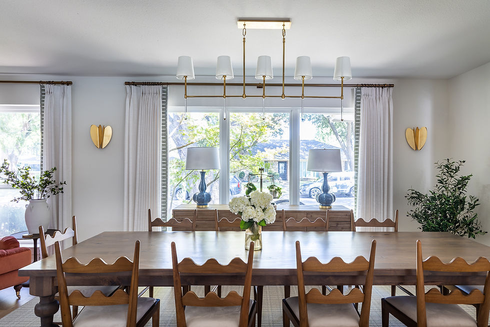
The table was custom from our favorite local furniture maker and is massive. The chairs feel like the estate sale find of a lifetime, but they're actually new, chosen because they had that vintage charm that we were after. Because we needed 10, and needed them to be sturdy, we opted for new over antique. The scalloped back feels like you inherited them from a super cool Grandma, in the best way.
Let's cozy up to that Bar.

It's honestly more than a Bar and more of a serving and display area. There is a paneled beverage fridge in the center, flanked by a mix of open and closed storage to hold all the hosting goodies.

The chairs have a sweet story. This couple actually loves each other a lot (good sign) and wanted a cozy pair of chairs to be able to escape the kid chaos slightly and have coffee or a glass of wine together while still being near the family when they're all downstairs.


They trusted us to go a little bit wild with this bold pop of rosy-terra-cotta velvet. It's this incredible focal point against that backdrop of soft blue and white.

Let's pivot towards the kitchen.

Oh man, is this kitchen full of custom touches: a reeded wood island, a ledge detail above the range, and a stone backsplash moment at the window. Let's take a closer look.

A dream range moment if there ever was one. A 48" Wolf range is the anchor for this back wall. The engineered quartz countertops run up to become our seamless backsplash, with my favorite little touch - this sweet little ledge above the range, that scallops down on either side of the windows.


Flanking the range are a pair of new windows, bringing daylight and epic amounts of charm into the kitchen. Centered on those windows are beams. The ceiling actually didn't change much from the old version, though we took the old 22-layers-of-paint beams down and replaced them with these gorgeous white oak beauties.

At one end of the Kitchen near the Dining Room is the new Sub Zero wide refrigerator situation (a dream). Way better food storage for this family of 5, with an appliance garage tucked over to the side.

Sort of haven't mentioned the whole "taking down a wall and added a big island" move. We did that! This used to be a galley kitchen, where the person cooking the meal was fully cut off from the goings-on of the family. No more.

A luxe small detail -the drawer fronts on the island are reeded white oak. A yummy texture and special little surprise.

We love a wood island, especially for families. Islands work HARD, kids kick the cabinets with their shoes, the trash drawer gets beat to smithereens. Having a wood island is much easier to touch up and keep looking nice through everything a family can throw at it (I mean that literally. Actual things thrown at it).

In what is probably an unexpected twist, we actually made the kitchen SMALLER by pulling in the wall on this end. I know, right? Didn't see that coming.
Before, there was a Breakfast Nook down here at the end, with that built in china hutch situation that all older homes have (you know what I'm talking about).
We ripped that sucker out, gave those 2 hyper-critical feet over to the Laundry Room behind that wall (more on that in a minute), and then built a Pantry forward into the kitchen, because Pantries weren't apparently invented until the 1980's.
Not content to just built a Pantry like regular people, we added a pair of blue doors with ribbed glass, because if you're going to do something, you might as well make it gorgeous.

Teasing our way over to the Living Room with this little peek towards our new built ins.
Ta da! Behold, the new Living/Great Room. Open to the Kitchen and Dining, with tons of seating, and even more style (if I do say so myself).

The Living Room actually didn't change size at all, but it feels worlds bigger now. With a neutral base of white walls and creamy sofas, pops of color abound. From the back of the bookcases to the stunning French blue chairs, this room is packing a punch.

The furnishings are a mix of new and old (and new meant to look old). The giant burl wood coffee table anchors our seating area and feels like a 70's find that could have come with the house. Lots of great display space, and equally functional to clear off for a family game of Rummykub.

These chairs may be my favorite thing in the whole house. Small in frame, deceptively comfortable, and are an unexpected wow that makes the room. The art above the fireplace is a nod back to an epic family trip to Mont-Saint-Michel in France. The parents remember this drip in its every detail - the beauty, the planning, the food, the memories.
The kid's favorite part was that they got to ride on hay bails.
Kids are fun.
My kid's favorite part of Switzerland was that they pet 3 cats. So I guess this is a thing.
I digress. Back to the tour!

We kept the original paneling and refreshed it with paint, and again added in white oak beams for warmth.

An art tv flanked by vintage-style prints softens up that wall and allows us all to pretend that we don't watch TV.

See, there's no remotes in that coffee table tray (we hid them in the console for the photo shoot). What TV?!

A vintage art piece and a new piece are best friends on this little wall. This door leads to the bedrooms, which is an amazing feature of older homes that I think we should bring back.

A couple more views so you can see how all of these spaces relate.

I imagine Thanksgiving is going to be EPIC this year. Maybe we'll get lucky and the Cowboys will even win!

Let's head back to the quiet hero of this renovation - the utility spaces.

This wall used to be the only usable wall in the laundry room. Front loaders allow us to add a countertop and cabinets for extra function. And on the other side...

Remember that built in china hutch that we ripped out? THIS is what we put back in its place. Those 2' deep cabinets that weren't doing a ton in the kitchen are doing the most in the laundry room with these floor to ceiling cabinets. Some are taller to hold mops, brooms, and a stick vacuum. Others have loads of adjustable shelves for cleaning products, sunscreen, pool towels, and all of the other products that are required to keep a household of 5 running.

A quick pit stop in the Powder bath, which used to be a full bath for the Guest Room. We gave the shower back to the Garage, behind, and wallpapered this sucker because why not!?!? The custom vanity is wood, like the island, because this bathroom is the one all guests will use and it helps to make it both durable and lovely.
Now, onto possibly our clients' favorite room...

The brand new Mudroom-slash-Mom Office!
Overflowing with function, from the left, we have: drawers and hooks for sports equipment, backpacks, lunch boxes, shoes, and out of season hats and gloves. Then in the tall cabinet, the home Command Center with file folders, a printer, and bins for sorting all of the papers that come home from school, manuals for all those swanky new appliances, and more.

And then - a built in desk with a computer. THIS is what those 1970's kitchens were trying to do with the weird Kitchen desk area that nobody uses. Not because the function wasn't needed, but the location was the problem. Having that in the busiest room of the house is chaos. Having it here, right off the garage where you're coming in and out, you can manage all of the stuff before it has chance to land on your kitchen counters and overtake your life.

Ok, also, past the function - look at the ceiling! It's wallpapered! And the star and cross pattern on the floor! A delight for the eyes and the heart.
Let's head to the new upstairs!

Listen, this isn't the world's sexiest photo. I get that. But you need it for context. A new huge sectional gives plenty of seating and also loads of floor space for play. This room will soon evolve to a Teen hangout and might want new bookcases and built ins, mounting the TV on the wall, adding art, etc. But that is for later. This room is doing what it needs to do for now, which is exist!

Now that you have the context, look beyond this yummy blue sectional into the new Guest Room beyond.
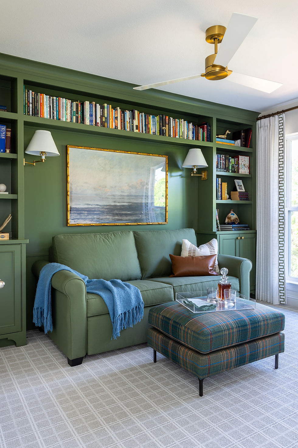
The Guest Room is only a guest room like 5% of the time. The other 95%? It's this cozy tucked away library!

This sofa has a secret - it is a sleeper! It folds out to a queen sized bed for Grandma and Grandpa. When not in use, it is the perfect spot to cozy up with a book.

Or, if you're a grown up, some Scotch.

We went bold with color in this space, with the same hue on the upholstery and built ins. Maxed out with books, with cozy reading lamps, and a precious plaid ottoman and plaid carpet - no notes.

Rounding out our tour is the Guest Bath.

Just off the Playroom and accessible to the Guest Room, this blue and white beauty works for both kids and adults.

The walls are tiled in a playful stripe, giving durability as well as serious style.
There we have it! And while yes, it’s beautiful (tooting our own horn a little bit), the real win is that it works. For this family. For their friends. For their future as their life evolves.
They stayed in the neighborhood they love. They made space for their people. And now, they have a home that reflects their values, their style, and their story.

Whether you're right here in Far North Dallas or elsewhere across the country, if you're looking to transform your home into a space that reflects your values, welcomes your people, and works beautifully for the life you’re living, please reach out! We’d love to help you bring it to life.


Wow, this reveal is absolutely stunning! I love how you balanced the aesthetic beauty with actual functionality for a busy family—it truly feels like a warm, inviting "forever home." Every time I scroll through gorgeous home design breakdowns like this, I get so much inspiration. Whenever my brain gets overloaded with decor ideas, I usually just take a quick break to play a minigame before diving back into more design blogs. Thanks for sharing this beautiful project!
Нещодавно виникла потреба організувати вантажні перевезення по Україні https://www.hort-trans.com.ua/perevezennya-po-ukrayini/ для регулярної доставки товару між кількома містами. Перед вибором перевізника переглянув чимало пропозицій, адже хотілося знайти компанію, яка не лише доставить вантаж вчасно, а й забезпечить нормальну комунікацію, зрозумілі умови співпраці та відповідальне ставлення до роботи.
Після кількох невдалих спроб співпраці з різними перевізниками звернув увагу на Hort Trans. Для мене важливим було те, що компанія займається саме логістикою та вантажними перевезеннями, має власний транспорт і пропонує комплексний підхід до організації доставки. Особливо сподобалося, що можна узгодити деталі перевезення під конкретні потреби, а не працювати за шаблонною схемою. Зараз це досить рідкісне явище на ринку.
За час співпраці відзначив оперативність у вирішенні питань, уважність до деталей та відповідальний підхід до транспортування…
At the same time, I keep thinking about how modern homes like this could benefit from smarter energy planning. Integrating apartment solar panels into developments like this would make the sustainability aspect even stronger. I’ve been looking at A1 Solar Store for ideas on how apartment buildings can realistically shift toward cleaner, more independent energy use without compromising design.
It reminds me that investing in your home, whether through renovation or just smart organizing, pays back in daily happiness. When we bought our place, we knew it needed work but the location was perfect. A home loan made it possible to afford both the purchase and the gradual updates. Now our home finally works for how we actually live, not how the previous owners lived.
This project reveal is really heartwarming creating a forever home for a family truly shows the impact thoughtful planning and community support can have. It’s inspiring to see how spaces are designed not just for living, but for comfort and connection as well. In a similar way, even small everyday choices like exploring 7 Brew menu with prices can bring a sense of enjoyment and personal touch to daily routines.