
our new house kitchen design
- Tara Lenney

- Feb 5, 2021
- 5 min read
Updated: May 15, 2023
Post contains affiliate links.
Ooooooh friends. This is the post I’ve been DYING to write since last summer. It’s the design plan for the kitchen in our new house! My kitchen is basically my life. I love cooking and baking and, aside from my desk and my bed, it’s where I spend the majority of my time.
When we were working with our builder on the upgrades to the builder-basic house, I allocated about half of my upgrade allowance to this room alone. It’s going to be a mix of things that our builder will do and many updates that we’ll do on our own after we close. I spent the majority of my upgrade budget on kitchen cabinets because that’s not something that’s easy to do after the fact (and kitchen design is sort of my life’s work, after all). Nearly everything else will be done after the fact.
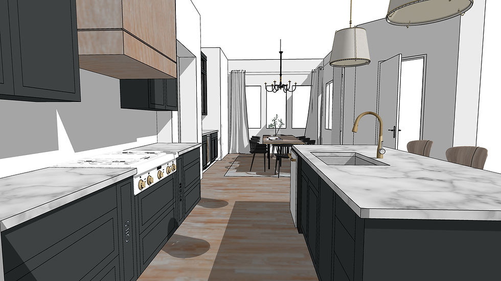
To get us all on the same page, here’s the floor plan of our kitchen:

It’s an L-shaped kitchen with a large island. I’ve NEVER had an island and I am very excited about it! I worked with our builder on the layout and customized the cabinets to have the bells and whistles that I know I’ll want, including pots and pans drawers, spice and cooking oil pull-outs, vertical storage for cookie sheets and cutting boards, and pull-out trash and recycle. In full OCD style, I’ve already assigned a job to every cabinet so I know exactly where everything will go – including a place to display my beloved vintage Pyrex collection.
Function – check.
Onto style.
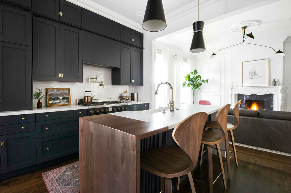


I knew very early on that an all-white kitchen wasn’t going to be for me. At our old house, we painted the base cabinets Benjamin Moore Newburg Green and I LOVED IT. Non-white cabinets are awesome for hiding the everyday dirt and splatters that happen in a kitchen, and white cabinets show ev-uh-ry-thing. We live in our house HARD so I knew darker cabinets were going to be a must. I found myself pinning kitchen after kitchen like these 3 dark beauties. The dark cabinets, light counters, backsplash, and wood accents are calling my name.
Fun fact, though. For our builder to paint the cabinets a dark color was going to be north of 10 thousand dollars. YOWZA. Plus they couldn’t get the exact off-black color I wanted. When we close on the house our cabinets will be all white, and we’ll paint them on our own with one of our favorite painters. (PS you can get LOADS of cost savings tips like this in our blog post on how to hack the builder upgrade process).

Here she is! Isn’t she a beauty?!?!
We upgraded the basic cabinets to include all the features I mentioned, plus a bit more to have a custom wood vent hood. Having allllll of that black felt a little too dark. The light wood to match our floors will lighten things up nicely. The eleven-foot ceilings also help to keep things from feeling too heavy.
The area on the left is the main kitchen area, and we also have built-ins in the dining area over to the right that will serve as our bar and my Pyrex showcase. I have a LOT of vintage barware that I’ve collected over the years and love that I’ll be able to display it all. I kept all of the cabinets on the kitchen side solid, though, since they’ll hold more functional things (we all have Tervis cups, and they aren’t that great to look at).
I’m toying with the idea of painting the pantry door the same dark green/black. It will be a game-time decision. Please feel free to weigh in!

Another thing that I was fully sure about is countertops. We upgraded to engineered quartz countertops at our last house and it was easily the best decision we made in that kitchen. Raspberries, coffee, sharpie, none of it is a match for those guys. We have granite in our rental and while it’s nice and still an awesome upgrade, I miss the bright white marble look of the quartz, especially when it comes to sharing food and baking with you guys! The brown granite just isn’t quite as photogenic. But that is exactly what will be installed the day we move in because that is what was standard. After we move in we’ll replace the countertops.
The thing I’m most excited about, though, is the appliances. I have been dreaming about Café Appliances since they launched a few years back and knew 100% that is what I wanted. We’ll have a gas range (hallelujah) which is the very best for cooking. I’ll have 6 burners for the first time in my life and plan to put them to good use. The best part, though, is the fancy pants French Chef-style oven with the double doors. The meals I will make here! You guys I cannot wait to cook in this kitchen! We ordered the appliances before Christmas because COVID has destroyed the appliance world and things are taking up to one or two years (yes YEARS) to arrive. So we may not have them on move-in day but fingers crossed that at least the range top will be here because that’s the only one that would be tricky to put back later. I will find a way to live without my wine fridge, somehow.
Still working through the details (so many cabinet hardware ideas, but definitely unlacquered brass!) and am in a marital tête-à-tête with Steven on the backsplash. I think Zellige tile is the way to go. He says it looks dated. I say that this is my actual job and he doesn’t know what he’s talking about. I wonder who will win?
HAHAHAHAHA it’s going to be me. Or at least it would have been before I put this on the internet and he reads it.
Love you, babe!
Here are all the pieces that are in the final running. We will close on the house in about 3 months (!!!) so it’s time to start pulling the trigger.

2. Sherwin Williams Greenblack
3. Pendants
4. Faucet
5. Sink
6. Knobs
8. Pulls
10. Range top
12. Refrigerator
13. Double oven
15. Some sort of vintage runner. This one sold out!
Cannot WAIT to show you how this comes together!
Quick Disclosure: Some of these links happen to be affiliate links which means when you click the link to purchase something on this page, it won't cost you more but I may receive a commission for sharing this with you. Which is neat, because I was going to share it with you anyway! You can view our full disclosure policy here.


JLBDT came up a couple times so I poked around for a minute just to get a feel for the interface. Didn’t sign up or test anything deep, more like a quick “is this annoying to navigate?” check on my phone. Honestly it’s pretty easy to move around—stuff you’d expect to be clickable is obvious, and I wasn’t stuck hunting for how to get back to where I started. The pages also don’t feel messy; the info is broken up in a way that’s readable instead of being one giant wall of text. As you scroll, the headings and grouped sections keep things clear, and the content stays in neat blocks with simple lists.
https://luck88.to/ hôm trước mình ghé thử vì thấy bạn bè nhắc, kiểu vào xem giao diện ra sao thôi. Ấn tượng đầu tiên là trang nhìn khá gọn gàng, mọi thứ chia theo từng khối nên lướt xuống không bị rối mắt. Mình cũng để ý trên thanh trình duyệt có biểu tượng ổ khóa, nên ít nhất cảm giác yên tâm hơn khi chỉ đọc thông tin. Tải trang cũng ổn, bấm qua lại vài mục không thấy bị đứng hay giật, dùng trên điện thoại vẫn dễ nhìn chứ không bị vỡ bố cục. Nói chung không phải kiểu màu mè quá, nhìn “sạch” và dễ tìm chỗ cần xem. Mình thích nhất là cách họ chia nội…
ball88 mình vào thử cho biết vì thấy nhắc nhiều, ai ngờ giao diện lại khá dễ chịu. Trang làm kiểu gọn gàng, ít chi tiết thừa nên nhìn phát là định hướng được ngay, không phải tìm mỏi mắt. Mình thấy họ tập trung nhiều vào phần sảnh lobby nên các khối nội dung xếp khá ngay hàng, kéo xuống vẫn không bị rối. Có đoạn nói về cách truy cập an toàn bằng VPN 1.1.1.1, viết ngắn gọn nên đọc lướt cũng hiểu ý chứ không kiểu hướng dẫn dài lê thê. Nói chung cảm giác như họ ưu tiên sự rõ ràng hơn là màu mè, nên dùng vài phút là quen tay. Mấy bảng thông tin…
https://f8beta.org/ mình thấy link này xuất hiện hoài trong mấy group nên tiện tay mở thử cho biết. Mình không phải dân chơi nên chỉ xem kiểu “ngó giao diện” với cách họ viết nội dung thôi. Trang chủ nhìn khá dễ thở, chia thành từng khối rõ ràng nên lướt nhanh vẫn nắm được ý chính, không bị dồn chữ một cục. Có đoạn họ nhắc cộng đồng thành viên hơn 10.5 triệu, đọc qua thì thấy họ đặt thông tin đó ngay chỗ dễ thấy nên người mới cũng hiểu họ đang muốn nói gì. Mình cũng để ý phần tiêu đề và các hộp thông tin canh thẳng hàng, nhìn gọn gàng, kéo xuống không bị rối…
hitclub mình ghé qua thử vì thấy bạn bè nhắc hoài, kiểu vào xem trang họ trông thế nào thôi chứ chưa định chơi gì. Vừa vào là thấy họ nhấn mạnh chuyện kiểm tra đúng link trước khi đăng nhập, đặt ngay chỗ dễ nhìn nên mình cũng đỡ lăn tăn hơn. Mình chỉ lướt nhanh mấy đoạn hướng dẫn cơ bản, đọc không bị rối, chữ nghĩa gọn gàng chứ không nhồi nhét. Giao diện nhìn khá đồng bộ, mấy nút đăng ký đăng nhập nằm rõ ràng nên khỏi phải mò. Điểm mình thích là trên đầu trang có hiển thị thời điểm kiểm tra link, nhìn phát là biết họ vừa cập nhật thông tin ở…